Flexible visual style of HyperLAN
You-et / May 27, 2014 / edited on Jan 30, 2020
HyperLAN organizes LAN parties, where players can play games together. As Commissary Media, it was my responsibility to establish the brand and visual identity, including two websites and props for during the events.
A gaming logo for HyperLAN presents the origin of the HyperLAN logo. It was important that it resembles the essence of the association. In this blog, the flexibility of the style is discussed in more detail. While creating the visual identity and style of HyperLAN, the following principle was developed: The design must adjust to medium and context. Three applications of this principle are:
- Flexible logo (e.g. to apply)
- Flexible colour theme (e.g. print vs. screen)
- Multiple screens (e.g. bigger screen)
Flexible Logo
The HyperLAN logo is clear and recognizable. It remains readable on light, dark or crowded backgrounds. Other variations are also recognizable, such as an image for the crew.

HyperLAN logo on white background.
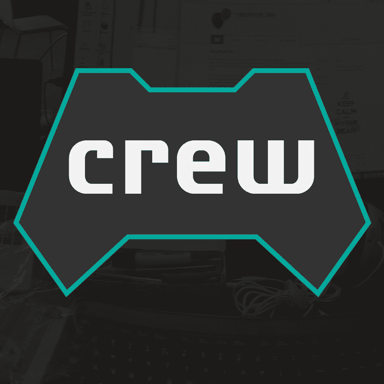
Logo of the crew on a dark background.
Colour themes
The dark colour scheme is based on the atmosphere of a LAN party; the lights are dimmed, as it makes the computer-screens look more intense. A bright website would result in big contrast with the background and feel like sunlight to a vampire.
When the context changes, the style changes too. For prints, sustainability plays a role. Therefore, the printing of large black backgrounds (A5 and up) is explicitly discouraged to save ink.
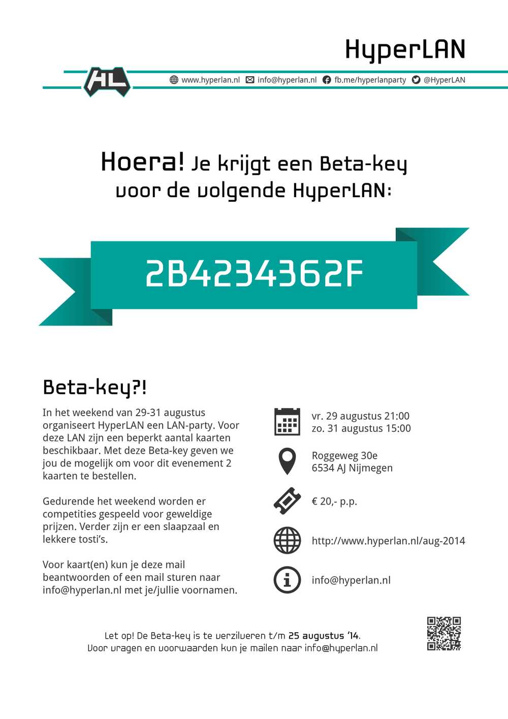
The Beta edition HyperLAN required a beta-key for ordering tickets. They were printed on A4 and therefore have no coloured background.
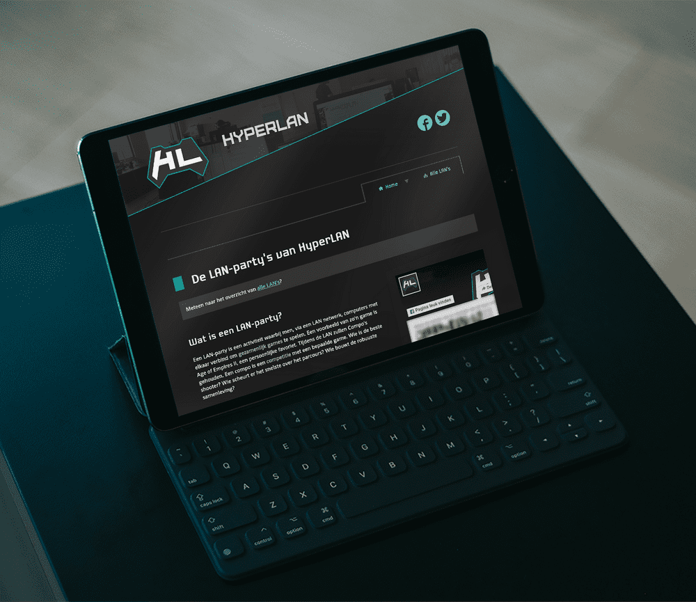
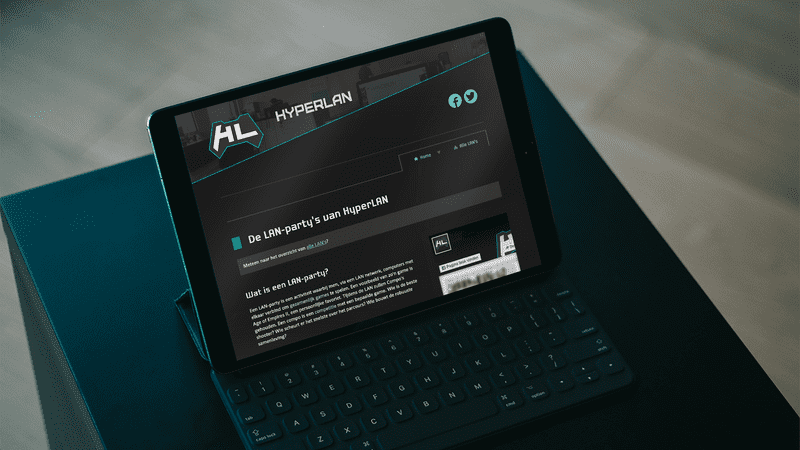
The website uses a dark theme so it matches the atmosphere of a LAN party.
Multiple screens
Anno 2014, a responsive layout is (hopefully) standard for websites. However, this does not mean that the default paradigm with three views is enough for every project. Besides the standard mobile, tablet and desktop design, HyperLAN has an additional view: the widescreen layout. It is common for visitors to use big and/or multiple screens.
Secondly, the website experiments with degrading navigation. The breadcrumb and menu change over the different window and screen sizes. Their shape, location and initially visible content adjust to the available space, so the focus is the main content. It is important that the user could at least always: 1) know where she/he is, and 2) go back to the previous 'level'.
The need for a complex navigation menu is less by a couple of measures. For example, the depth of the website has a maximum of 3 levels and the main content shares the responsibility for the user's orientation on the website. The main article/page has a clear header and it's content contains relevant links independent of the navigation. This way, the number of direct links could be reduced for smaller screens. In any case, the site keeps the minimal required info and links intact.
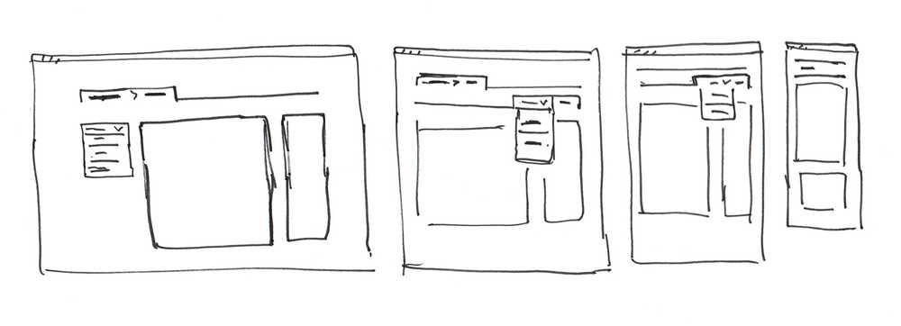
The breadcrumb and menu change over the different window/screen sizes.
If this approach also works for other projects? Maybe not. The widescreen view works great and proper content is never wasted money. Changing what the user sees at first glance for the different screens could be fine. However, the minimum required amount of links for the menu navigation is tricky. What and which is the minimum?
This internal website of HyperLAN is very small and used to look up a specific detail during a LAN party. The content is not complex and easily ordered. There is not even a search page. Larger, more complex or interlocked content needs rich navigation for e.g. orienting and searching users. In that case, I would rather focus on 1) the context the users need, and 2) how the navigation shows what the site has to offer.
