A gaming logo for HyperLAN
You-et / May 20, 2014 / edited on Jan 30, 2020
The LAN party association, HyperLAN, was founded by four friends. As Commissary Media, it was my responsibility to establish the brand and visual identity, including two websites and props for during the events.
HyperLAN Association
HyperLAN organizes LAN parties. A LAN party is an activity in which computers are connected via a LAN network, such that players can play games together. HyperLAN characterizes as a friendly community, where inexperienced players and hard-core veterans are equally welcome. We express this in the decisions we make, such as selecting games.
The First Presentation
The design process started with the name, which was followed by the logo and look&feel. Mind maps, brainstorming and a lot of sketching resulted in many logos and ideas. However, none of these results was used. Although the board approved the logos, these sketches had no connection to what HyperLAN does.
Do you associate it with playing games?
Most concepts were inspired by hypercubes (multidimensional cubes) and superhero groups. I asked myself too late if the results resemble the essence of HyperLAN. In conclusion, they did not. The concepts misted the connection to gaming, which is the main activity at a LAN party.
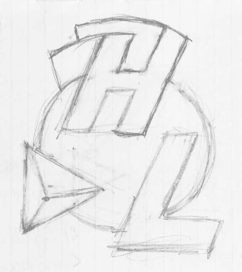
A sketch from the superhero concept
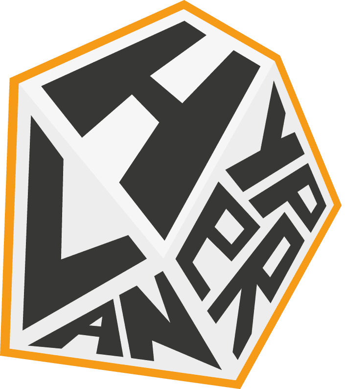
A sketch from the hypercube concept
The Final Logo
HyperLAN wanted both hard-core and casual gamers to come to play games. This formed the base for the new concepts in ideation.
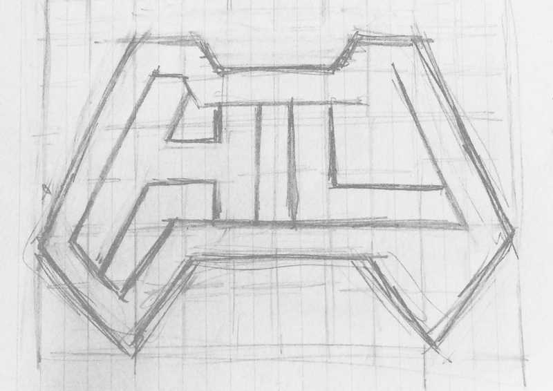
The final logo is inspired on the Xbox 360 controller. Controllers are visually strong identifiable and related to consoles and PCs. In the gaming scene, consoles are sometimes (unnecessary) mocked for being too casual. Therefore, a game controller perfectly symbolizes gaming and serves casual and hard-core gamers.
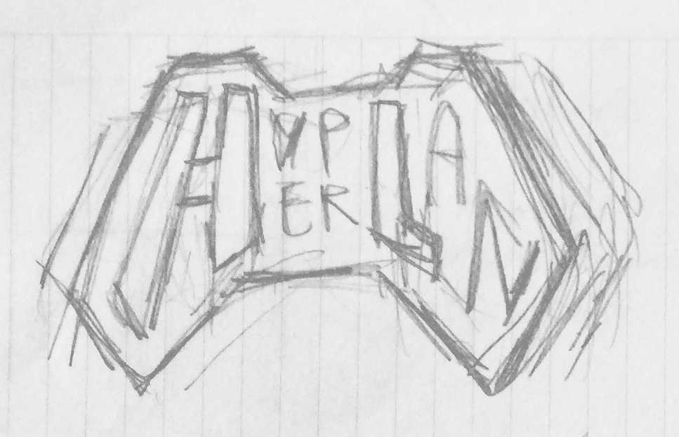
A sketch from the controller concept with the full name incorporated.

A sketch from the controller concept with only 'HL' incorporated.
The colours in the HyperLAN visual identity are dark. This is based on the context; the lights are dimmed during a LAN party, as it makes the computer screens look more intense. More is explained in Flexible visual style of HyperLAN. Now, the readability, recognizability and meaning of the final logo and style are high and visualizes what HyperLAN is.
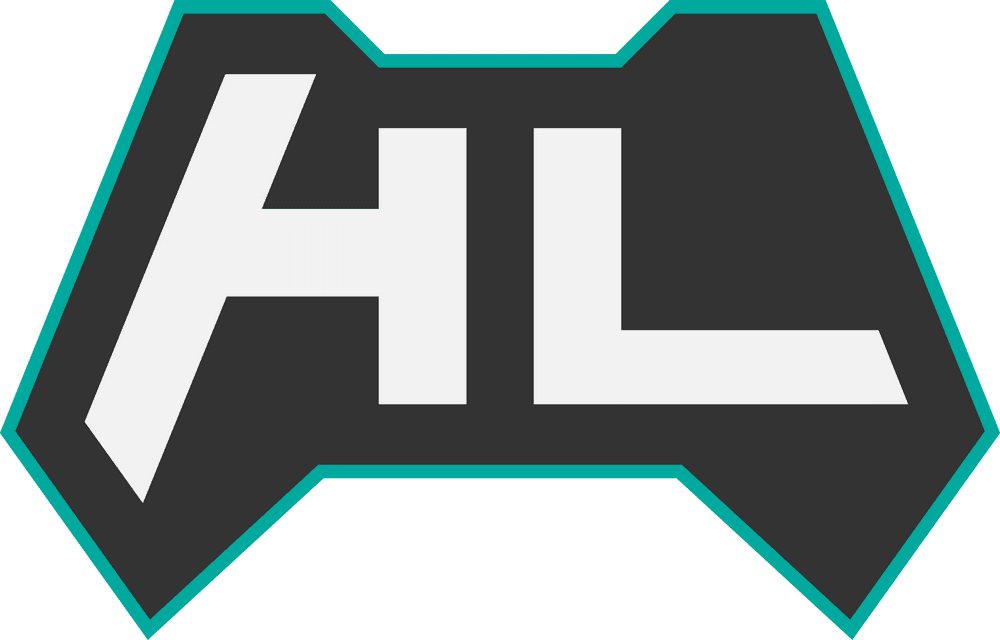
Logo of HyperLAN
