Redesign of the Online Leeromgeving to fit in the University ecosystem
You-et / May 4, 2018 / edited on May 14, 2021
The online learning platform (OLO) is a platform for students and teachers to help the students learn and practice their secondary education subject matters. I took care of the redesign of the platform. It was challenging to balance the MVP process, the parent organisation (University of Twente) and a new identity.


Introduction
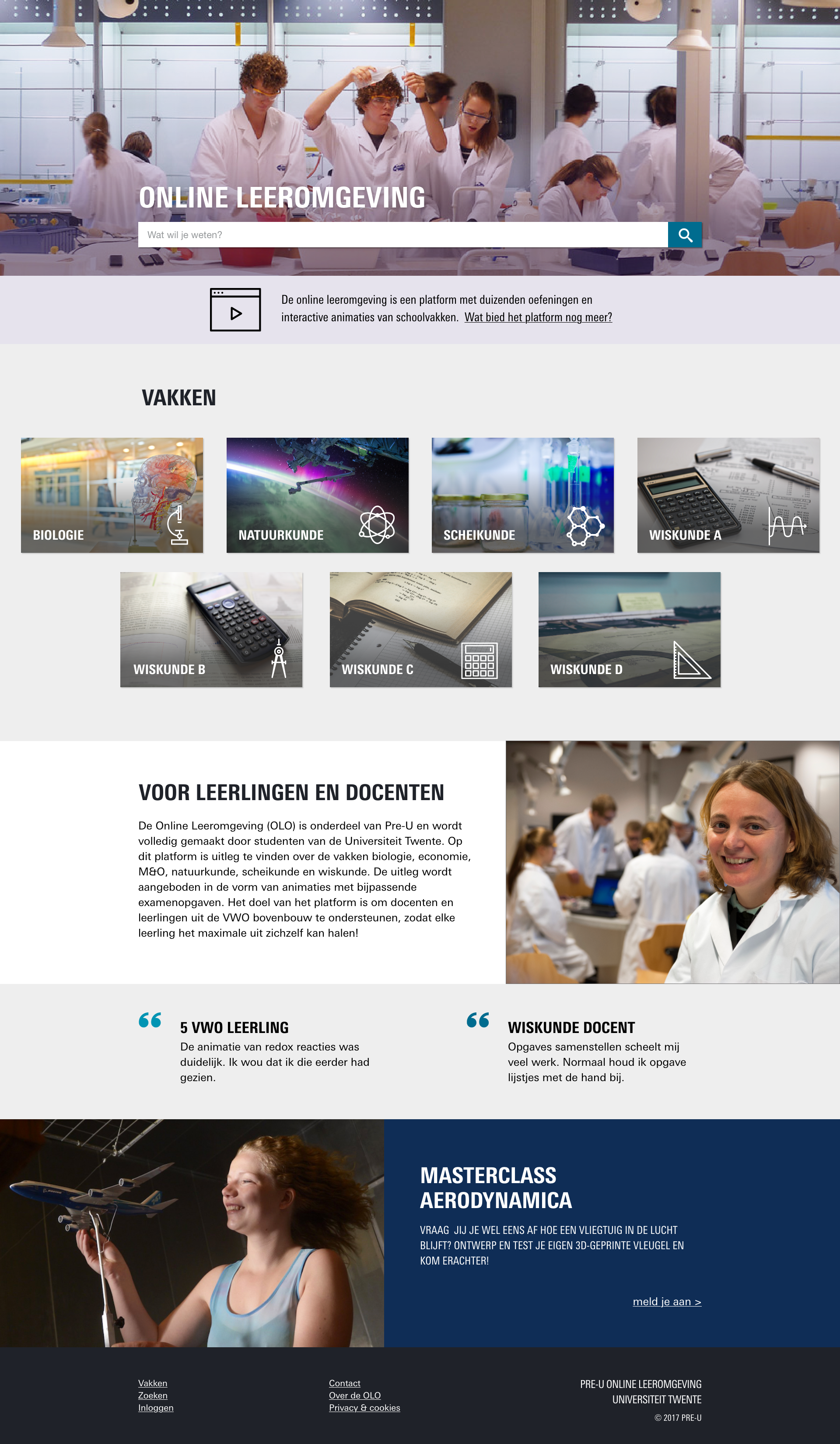
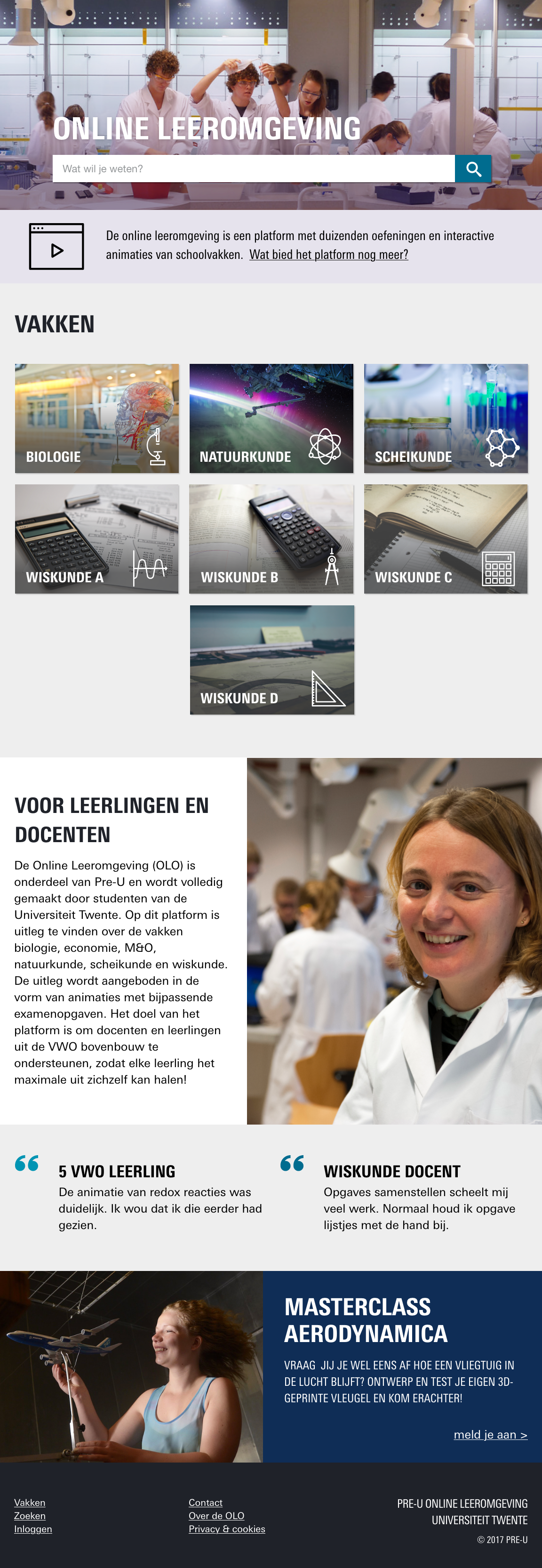
The online leeromgeving (learning platform) of the University of Twente (UT) is a platform for students and teachers in secondary education. Students discover how things work with interactive animations and test their knowledge with exercises. Teachers use the platform as additional materials in class and compose series of exercises for students to practise.
The online leeromgeving (OLO) team consisted of a project manager and three sub-teams; 1) the content team, which wrote stories based on the national compulsory course materials, 2) the animators, who turned the stories into interactive animations and 3) the development team, which build and maintained the front-end and back-end application. I joined the ongoing development team as a designer and styling front-end developer. The other team members were four developers. There was a lot of freedom with OLO and there was not much supervision.

The OLO team that started on a replacement OLO before I joined
Defining and implementing the MVP
The prominent goal was to go live as soon as possible. Over a year new content was created that depended on a new platform. Since there was no MVP defined, the challenge was to define and implement the MVP. During the process, other challenges came to light such as the visual style.
Managing the project
Step 1: Inventarisation
The first step was to analyse the situation. This included the old platform, the platform that was under construction, the development team, its process, the stakeholders and their goals. As it turned out, the focus from both team and stakeholders was very technical. The old site needed to be replaced because Flash was no longer supported and the new platform had only two requirements: going live asap and a login functionality. From my analysis, I made the following additional conclusions:
- The core was not yet implemented (e.q. exercises) and the animations were not playable. Furthermore, it contained partly implemented features. For example, some buttons would not do anything.
- It contained already too many unnecessary and double pages. I got lost how to revisit some of the module overview versions I had found. There was no consistency in UI nor visual style. (No wonder that I got lost)
- The WIP platform was visually a bit of a mess. It had no clear identity on its own. It had no connection to the original platform or University style.
Step 2: Cleaning the ship (Dutch expression)
"Cleaning the ship" is a poor translation of the Dutch expression "schoon schip maken". It means that the clutter of the past is (rigorous) removed so that something new can start. In this case, I cleaned the ship by stripping the WIP application. I wrote user stories to remove components or whole pages and I decided to tackle the UI and visual inconsistency by a redesign.
Starting with removing instead of building the essential features had a couple of advantages. It was a good exercise for the team. We had one common goal and the relatively easy tasks provided the opportunity to analyse the team's process. Secondly, I was afraid that the platform would go live with all the user problems on board. In my eyes, that user experience was worse than keeping the old platform online a little bit longer. This cleanup would take a short time and was necessary in any case since the code was not maintainable this way.

Sketches with priority guides and flows assisted to keep track of the pages
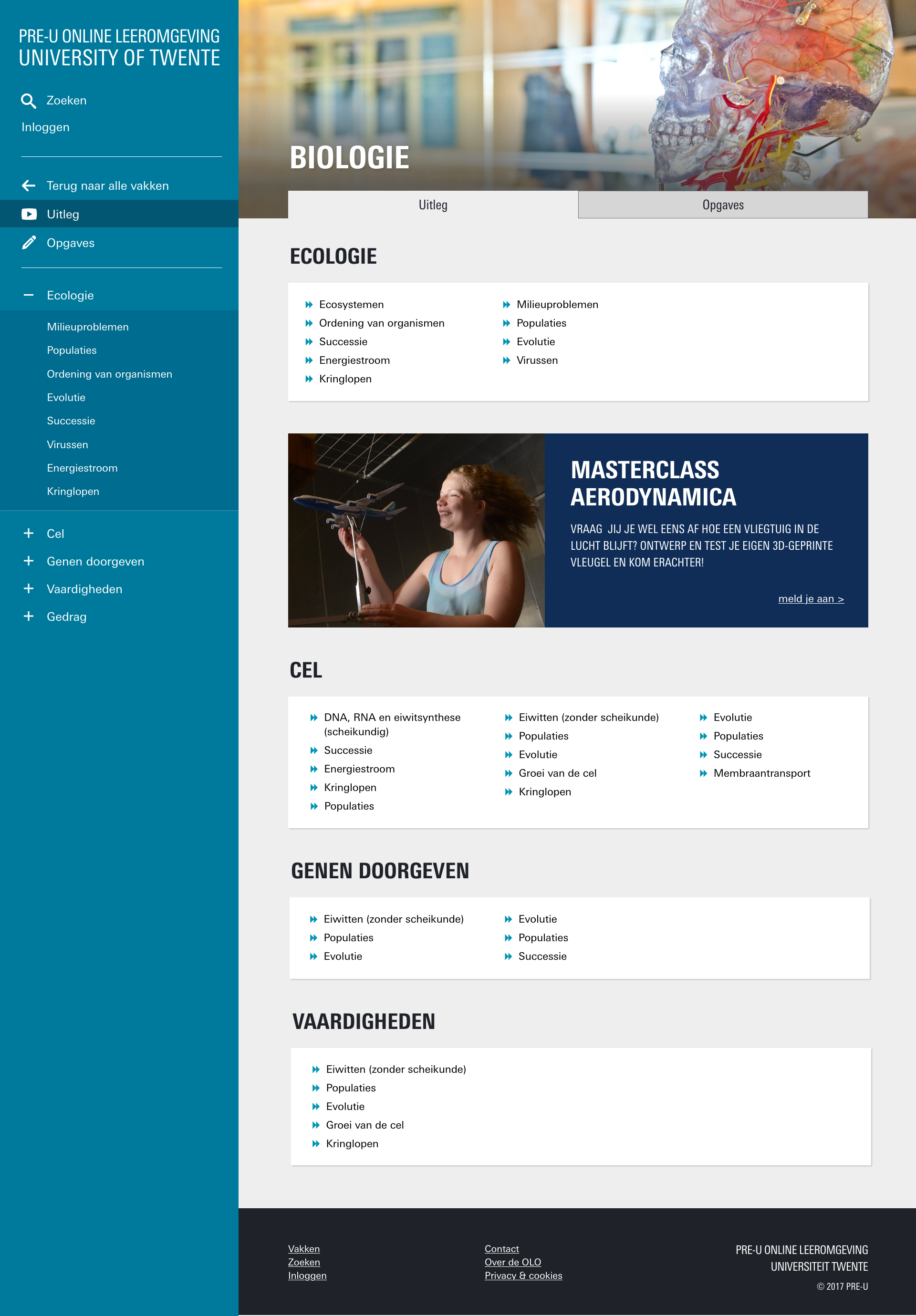
Step 3: UT or not UT, that is the question
While the developers tackled some technical features without design, I focussed on the redesign. What style would fit the OLO? First, we need to start with the question: "Why does the university has a platform for secondary education students?".
The OLO team is part of Pre-U. The university's marketing department established Pre-U to introduce secondary education students to the UT. Therefore, I contacted the marketing department about introducing the UT style in the OLO. This way, the students could recognize the OLO as part of the university.
However, the stakeholders from the marketing department were averse to matching the styles between OLO and UT. They were afraid that the development of their main website would suffer. At the same time, my idea was not set on a replica style. The UT website felt too mature and we agreed upon a UT style "spin-off". The intention was to keep the same feeling with a creative license to deviate.

Comparing the original and UT style
Step 4: The design process
For the first part of the project, I used Adobe XD for designing and communicating about the new OLO style and components. Succeedingly, I switched to "designing in the browser" due to time constraints. This means that I no longer used a design application for certain design tasks. I sketched several wireframes on paper and then directly designed the visual in the front-end code. It saved a lot of time since it reduced the double work.

Sketches in Adobe XD
Results
The new minimum viable product of the OLO platform was online! We solved the main problems: the core elements were implemented and the pages, components and visual style were redesigned. We used the Usabilla feedback tool to collect user insights. The reactions were mostly positive. The few negative reactions mentioned bugs or missing features compared to the original platform.
Next steps
The MVP was live, but at a cost. The scope of every story was narrowed down to the smallest possible version. But more importantly, there was limited user testing. The next steps were fixing bugs and the login epic. The login epic contained a personal dashboard with handy features for customization of the platform. All content should still be accessible without login and therefore the login was not part of the MVP.

Users that login have more features such as bookmarking and tracking progress.
Reflection
There is still much to do and my biggest regret is that user testing was out of scope. We did some limited usability testing and asked coworkers to systematically do end-to-end testing. But we have no excuse. There are many techniques for user testing, including cheap and "skunkworks" UX testing (NNgroup, 2006). Skunkworks refers to an independent and small research group for (radical) innovation.
My second comment is on designing in the browser. If I could repeat the project, would I do it again? Maybe. The advantage was clear since it saved me time so I could keep up with the developers. The priorities and resources were limited, and this was the best solution at the time. However, there is not much "proof" of my work left. There are no files, no pictures nor documentation of the designs I made. The OLO that's online in 2020 does not quite resemble the one I've left behind. I'm curious about what has happened.
Looking back, I could have done many things differently. Knowing that proves to me how much I've learned in the meantime. Most important, I'm still proud we of the MVP we put live.